Monday 16 January 2012

Using Photoshop


Before this project, I had a very limited knowledge of photoshop. I had only used basic tools and features in the preliminary task at the start of the year. I feel I have gained a good understanding of Photoshop through the two ancillary tasks and learnt 'short-cuts' to improve our efficiency in lessons.

We wanted to include the style of photo we found on 40's/50's adverts and on Caro's 'Stuck' album on at least one of our photos of Ashlea. My first idea was to digitally colour the photo on SketchBook Copic Edition. Below you can see my first attempt, using two layers: the photo as the background which could be faded down to reveal the painted layer on top. This way, I would not be painting from scratch and I could pick the colours from the real photo to make it as realistic as possible. 
Unfortunately, the version I have is a free download and I did not realise this would mean that when I saved, the two layers would merge automatically. 

This is the painted, airbrushed 
effect we wanted to achieve

We contemplated buying the full version to be able to use this technique but decided against it. So our next step to style the photo in the way we wanted was to explore the different filters on Photoshop. These did not work as well as we had hoped, they were all too obviously a 'tool' used on software, rather than the faded paint effect we were after. Below you can see some effects we tried to make a vintage effect that, in the end, did not work the way we wanted.
At this point we had to compromise. We realised that with our budget, time scale and software, we could not use the 40's advert style we were hoping to. However we could use i Photo to tint the photo a warm colour and the paint tools on Photoshop to 'airbrush' the photo to look 'matt'. 

First we had to remove the green screen background. We used the rubber tool and pressed these keys to quickly make it smaller and bigger.  And pressed Control with the mouse to zoom in and out. 
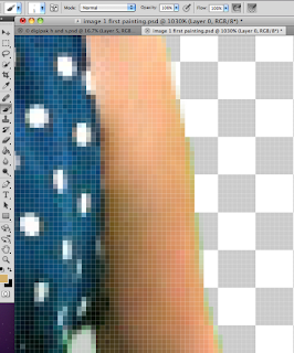
This screenshot shows how, when we had rubbed out all the background, there were still some green tinged pixels around the image as the green screen had created small shadows on the model. Instead of cutting of more of the picture, we used the pipette to get a natural skin tone and painted over the green. We found that if we held down Alt while we where on the paint brush tool, it would change to the pipette automatically. This saved a lot of time!

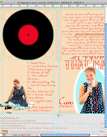
We spent time researching exactly the right font to use as the title of the album. We had found a very '50's' looking font for the rest of the text on the digipack called '...' but when we used it for the title, it did not look dramatic enough. The website DaFont.com was very useful in this research and we found at least 4 that could work. The pictures below are example of an earlier version of the design, where we tried out each font. I found it really valuable, being able to see the fonts like this, quickly and in the context of the whole pack.

(Click any image to enlarge as some are quite detailed)
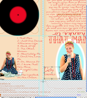


We tried the same process when we came to her name 'logo'. We had learnt from our research that the name is almost like a signature so it was important to get it just right. After trying many different 'handwriting' fonts we decided to use the same technique we had used for the photo of Ashlea in the first place. Using an image of her name as a template and painting over the top. 
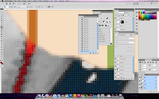


Before we used the image from the video, we were thinking of using another photo from the green screen shoot and tone down the colours. Making the image almost transparent, so the text could still be read. This was probably the most complex thing we attempted on Photoshop. In a new window, we removed the background with the eraser tool and the magic selection tool (?), then used the sponge tool to wash out the colours apart from the red accessories. Using the magic selection (?) did take away some of the red from actual image. This meant we had to paint it back in with the pipette and 
brush tools. 


Once the image was ready we rotated it and opened the layer style window where we found the opacity sliding scale which we dragged down to 53.

Magazine Advert Designs


Below are scans of our (very) initial sketches for the magazine advert to be published in a magazine. We went through, quickly writing the advantages and disadvantages of each design.


This idea uses the same design as the digi pak front cover. While this links both products strongly, it does not allow us to be creative with a different media product.


This second idea was linked to the digi pak in the same way, by using the black and white image from the end of the video and the inside of the digi pak. Again, this links the 3 products together but takes away the colour scheme we worked into the video and digi pak. This meant we used a cream coloured box with red writing at the top, in the end we decided to this would look out of place and unprofessional. 

This was the idea we eventually used, after some experimentation with the collage idea below. I really liked the idea of the photo of Ashlea interacting with the photo of the digi pak. It is original and therefore more memorable than seeing the same image twice. It shows the digi pak (as we saw in our research it is conventional include an image of the album). 


Before we used the 3rd design, we experimented with a different idea that was inspired by photo we found researching album covers. This photo of Imelda May in front of a wall plastered with vintage posters gave us the idea to create a collage of images from our video, props and photos of Ashlea as Caro in the style of this wall. We screen shot recogniseable moments from the video and took photos of the props with an improvised white back drop set. with a white sheet and angle poise lamp. We imported the photos to i photo and edited them and were very please with how the photos looked.

Some examples:


We placed the cut outs in an overlapping collage design over the top of the newspaper I bought as a prop for the video. We then used a piece of glass from a picture frame to keep all the photos flat and still while we took the photos.


We edited the same photo twice to give us one in colour and one in black and white. This allowed us to see the same three fonts on each design.


Out of all the variations, we preferred this black and white version using Velosette font because the red text looks best against the black and white background, its more contrasting. and the images look more professional in monochrome, and more like a collage of images which is what the design was inspired by.


However, we decided that the concept did not fully work as size of photos we had to use to make them recogniseable, was too big to be similar to the look the wall of posters had. Also the gaps in between the photos to show the newspaper looked unprofessional. 

We went back to our initial designs and constructed the 3rd idea in photoshop. 


Here are the colour variations of the final product we mocked up on photoshop to be absolutely sure that light blue was the colour to use for the background.
We tried using the same colour as the background of the digi pack to link them in that way. This meant that the edge of the pak disappeared and merged with the background. This was not an option. 


Keeping with the colour scheme we have used were possible throughout the project, we tried a red background. Initially we liked this more than the blue, but when we saw that the green tint given by the green screen was more noticeable on her hair with this one and that the strip of red on the other edge of the pak disappeared, we decided against using it.

With light blue, there was no problem of the edges of the digi pak merging with the background and the tint from the green screen on Ashlea'd hair was not as noticable. We tried our best to tint her hair blonde again but it was not possible as we had no real blonde colour we could use the pipet tool to use as paint. 


We are very pleased with the final magazine advert.
If it were to be in a magazine, we decided that it probably would not be in the magazines we looked at for research as they are mainly aimed at teen - 40. And Caro has three generation appeal but is mainly liked by females so the advert would appear in a magazine like marie claire, radio times (the real Caro's adverts have previously appeared in here) or ... to reach all ages of her audience. 

Saturday 14 January 2012

Magazine Advert Research


For our research into album adverts in music magazines. We bought MOJO and NME and Q magazine to get an idea of how bands and artists advertise their new albums. To the sides are examples of adverts we found in the three magazines. The four main types of image used for the advert are:
    • A photo of the band or artist, showing their style or genre through the mise en scene. (OSA)
    • An exact copy or similar image that is one the album, used as the advert. (Coldplay)
    • An image relating to the album used as the advert
    • A totally unrelated image used as the advert. (MSP)
    The information included on the advert is usually very minimal:

      • The artist or bands name
      • the name of the album or tour
      • when it will be released or 'Out Now'
      • a quote from a music magazine 
      • where the product is available .e.g. 'hmv.com' or 'amazon.com'.
      • Sometimes a small image of the actual album is placed at the bottom of the advert.


    We also found this advert for a collection of Elvis Presley products, including a digi pack. the photo of the digi pack is 3D to make it clear it is not an album. it would be useful to be able to take a photo of our digi pack like this for our magazine advert but it might not be possible due to the resources we have in school. 


    Thursday 5 January 2012

    Digi Pak Research and Designs

    Example of a Digi Pak
    After looking at a collection of digi paks bought in by our teacher. we knew we needed to have a striking image for the front cover like a normal album cover but that we also needed to decide the layout of the pak and design two more panels.

    Below are some initial designs for our digi pak 


    This note was made after a discussion we had about who Caro's audience were, so we could design accordingly. We found that she has a 3 generation appeal. Young people 15-18 (such as our trumpet player) like her - it is fashionable to like retro/vintage; parents aged 40-50 and grandparents aged 60-70 like her because they liked the style of music when it was first popular.


    We wanted to reflect Caro's music in the design as much as possible and we think these colours, the costume and the organic framing feel 'vintage' and 'retro' but with a modern production (using a HD camera and photo shop to construct it),  which is what Caro's music is all about. 


    We experimented with the design - by using more layers, we could instantly swap and change the font, different poses or filters.  There were some things we didn't change, for example: the colour scheme has always been red and blue, linking with the music video.